The Icon Block in the Gutenberg page builder allows you to add and customize icons throughout your website. It’s a great way to enhance your content with stylish, meaningful visuals. You can choose from hundreds of icons available in the Icon Library and use them to highlight features, services, or other key content.
Explore the sections below to learn how to use the Icon Block with aThemes Blocks.
How to Use the Icon Block
To get started:
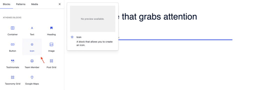
- Enable the Icon Block from the Blocks Dashboard.
- Once enabled, add the Icon Block to your page.
- After adding it, you can begin customizing your Icon settings.

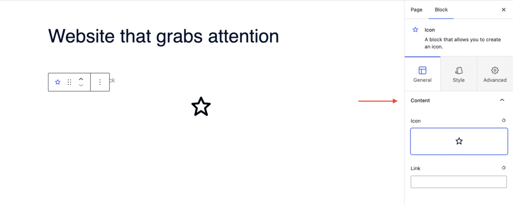
General Settings of the Icon Block
When the Icon Block is selected, go to the General tab in the settings sidebar. Here, you can configure:
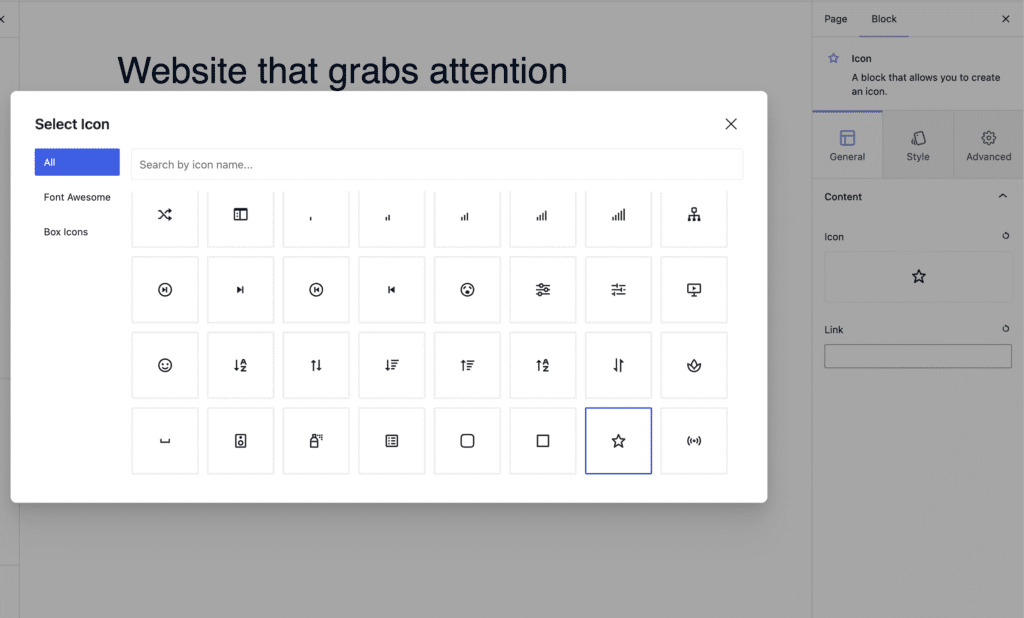
- Content: Select an icon from the Icon Library, which includes options like Font Awesome and Boxed Icons. You can also add a link to make the icon clickable.
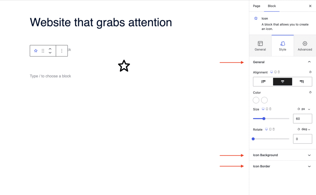
Styling Options for the Icon Block
In the Style tab, you can customize the icon’s appearance:
- Alignment: Align the icon to flex start, center, or flex end.
- Icon Settings: Adjust the color, size, and rotation of the icon.
- Icon Background: Choose a background color and define the height and width of the background area.
- Icon Border: Set the border style: solid, dashed, dotted, etc.
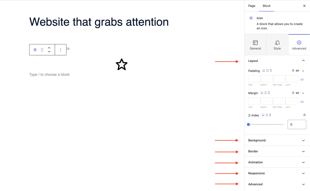
Advanced Settings of the Icon Block
In the Advanced tab, you’ll find further customization options:
- Layout: Adjust padding, margin, and Z-index.
- Background: Set a background color for the entire block.
- Border: Define the border style of the entire block (solid, dashed, dotted, etc.)
- Animation: Apply entrance animations like slide in, fade in, zoom in, rotate in, flip in, and more.
- Responsive: Control visibility by hiding the block on desktop, tablet, or mobile.
- Advanced: Add custom CSS classes or CSS IDs for additional styling.