The Button Block in the Gutenberg page builder allows you to add customizable buttons throughout your website. You can control each button individually and adjust its color, shape, size, border, hover effects, and typography.
Explore the sections below to learn how to use the Button Block with aThemes Blocks.
How to Use the Button Block
To get started:
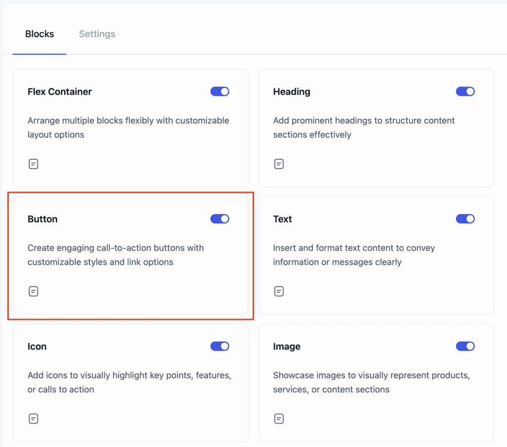
- Enable the Button Block from the Blocks Dashboard.
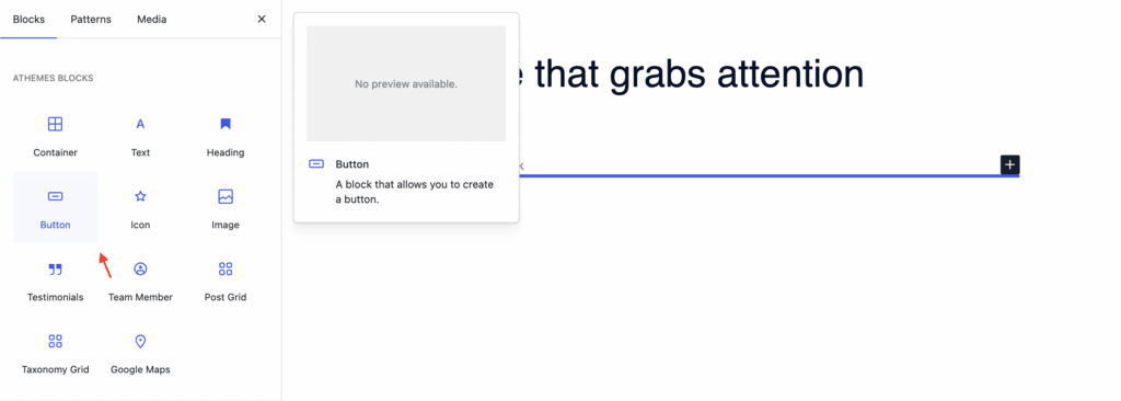
- Once enabled, add the Button Block to your page.
- After adding it, you can begin customizing your button settings.
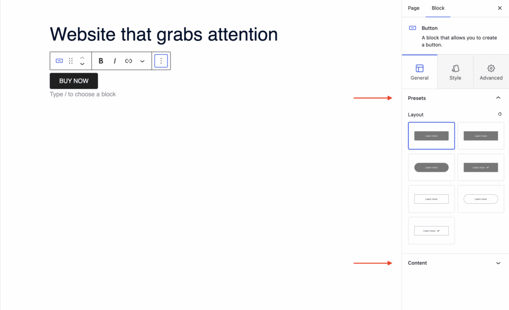
General Settings of the Button Block
When the Button Block is selected, navigate to the General tab in the settings sidebar. Here, you can configure:
- Presets: Choose from predefined button layouts.
- Content: Add a link, include an icon, and set a button ID
Styling Options for the Button Block
In the Style tab, you can customize the button’s visual appearance:
- Content: Set button alignment to left, center, right, or full width.
- Text: Adjust typography settings and set the text color.
- Background: Choose a background color for the button.
- Border: Define the border style (solid, dashed, dotted, etc.) and set the border radius.
- Spacing: Adjust the padding of the button.

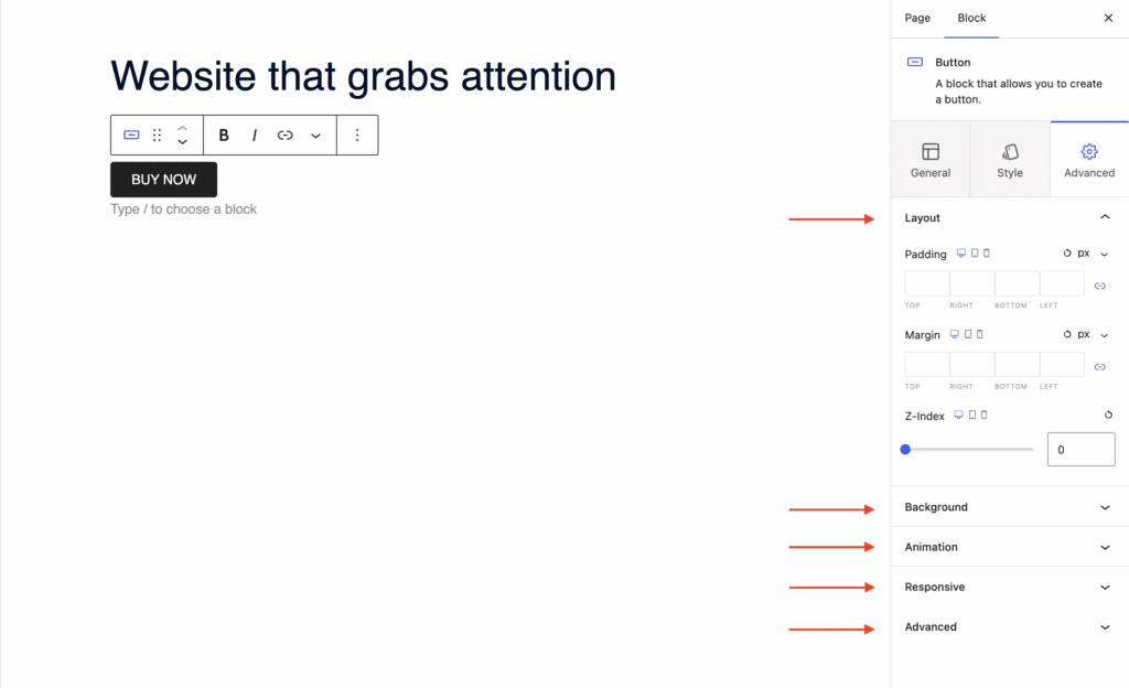
Advanced Settings of the Button Block
In the Advanced tab, you’ll find further customization options:
- Layout: Adjust padding, margin, and Z-index.
- Background: Set a background color for the entire block.
- Animation: Apply entrance animations like slide in, fade in, zoom in, rotate in, flip in, and more.
- Responsive: Control visibility by hiding the block on desktop, tablet, or mobile.
- Advanced: Add custom CSS classes or CSS IDs for additional styling.