Using the Taxonomy Grid Block
Want to showcase your site’s categories, tags, or custom taxonomies in a structured grid? The Taxonomy Grid block in aThemes Blocks displays taxonomy terms in a clean, user-friendly layout with preset styles, carousel support, and full control over content and buttons.
In this guide, we’ll walk you through how to enable, configure, and style the Taxonomy Grid block with aThemes Blocks.
Before you get started, make sure you’ve installed and activated the aThemes Blocks plugin on your WordPress site.
Enabling the Taxonomy Grid Block
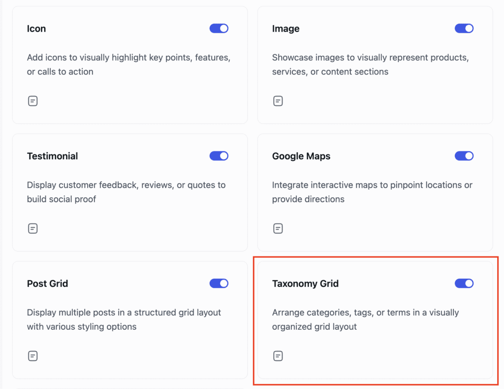
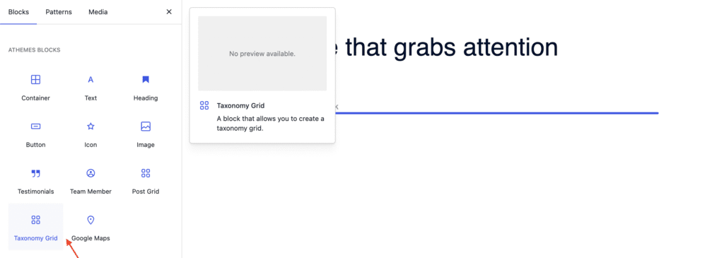
First, enable the Taxonomy Grid block from the Blocks Dashboard. Once enabled, open any page or post and add the Taxonomy Grid block from the block inserter.
Configuring General Settings
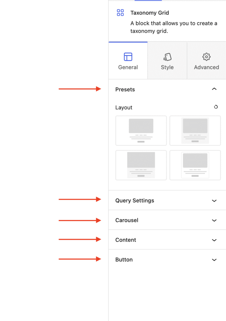
With the Taxonomy Grid block selected, open the General tab in the settings sidebar.
Presets
Choose from four different layout styles.
Query Settings
- Taxonomy Type – Select categories, tags, or custom taxonomies.
- Terms Per Page – Set the number of terms displayed.
- Exclude Current Term – Skip the currently viewed term.
- Hide Empty Terms – Avoid showing unused categories or tags.
- Order By and Order – Sort by name, count, ascending, or descending.
Carousel
Enable or disable the carousel feature for a sliding layout.
Content
Choose whether to display the title, title tag, and description of each term.
Button
- Show or hide a button for each term.
- Choose whether the button opens in a new tab.
Styling the Taxonomy Grid Block
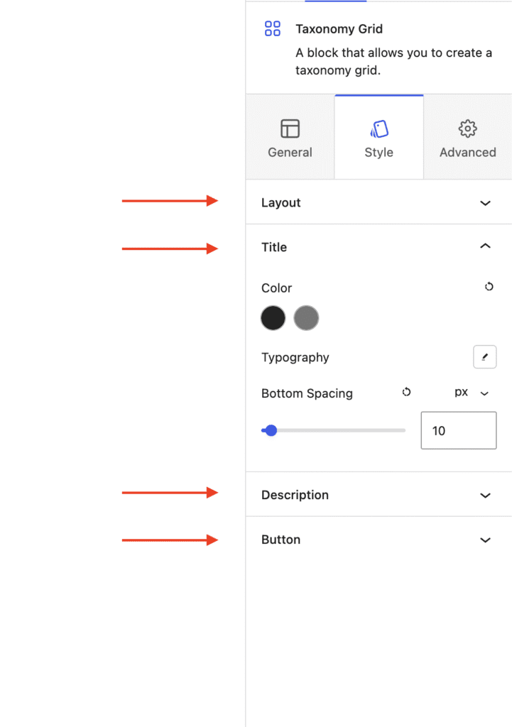
Switch to the Style tab to customize each element:
Layout
Set the number of columns, adjust column and row gaps, pick a background color, choose a border style, control vertical and horizontal alignment, adjust card padding, and decide whether to apply padding to content only.
Title and Description
Customize color, typography, and bottom spacing for both the title and description.
Button
Set text color, typography, background color, button style, padding, and bottom spacing.
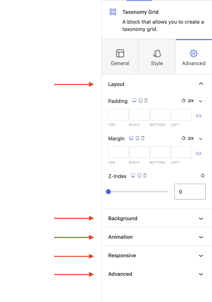
Configuring Advanced Settings
- Layout – Adjust padding, margin, and Z-index.
- Background – Set a background color for the entire block.
- Animation – Apply entrance animations like slide in, fade in, zoom in, rotate in, or flip in.
- Responsive – Hide the block on desktop, tablet, or mobile.
- Advanced – Add custom CSS classes or CSS IDs for further styling.
That’s it! You’ve successfully built a custom taxonomy grid on your WordPress site using the aThemes Blocks Taxonomy Grid block.
Next, would you like to add a navigable table of contents to long pages? Check out our guide on Using the Table of Contents Block to learn more.